Overview
Problem
Cluttered user experience and boring design, which decreases the user’s stay on the website and increases the bounce rate.
Outcome
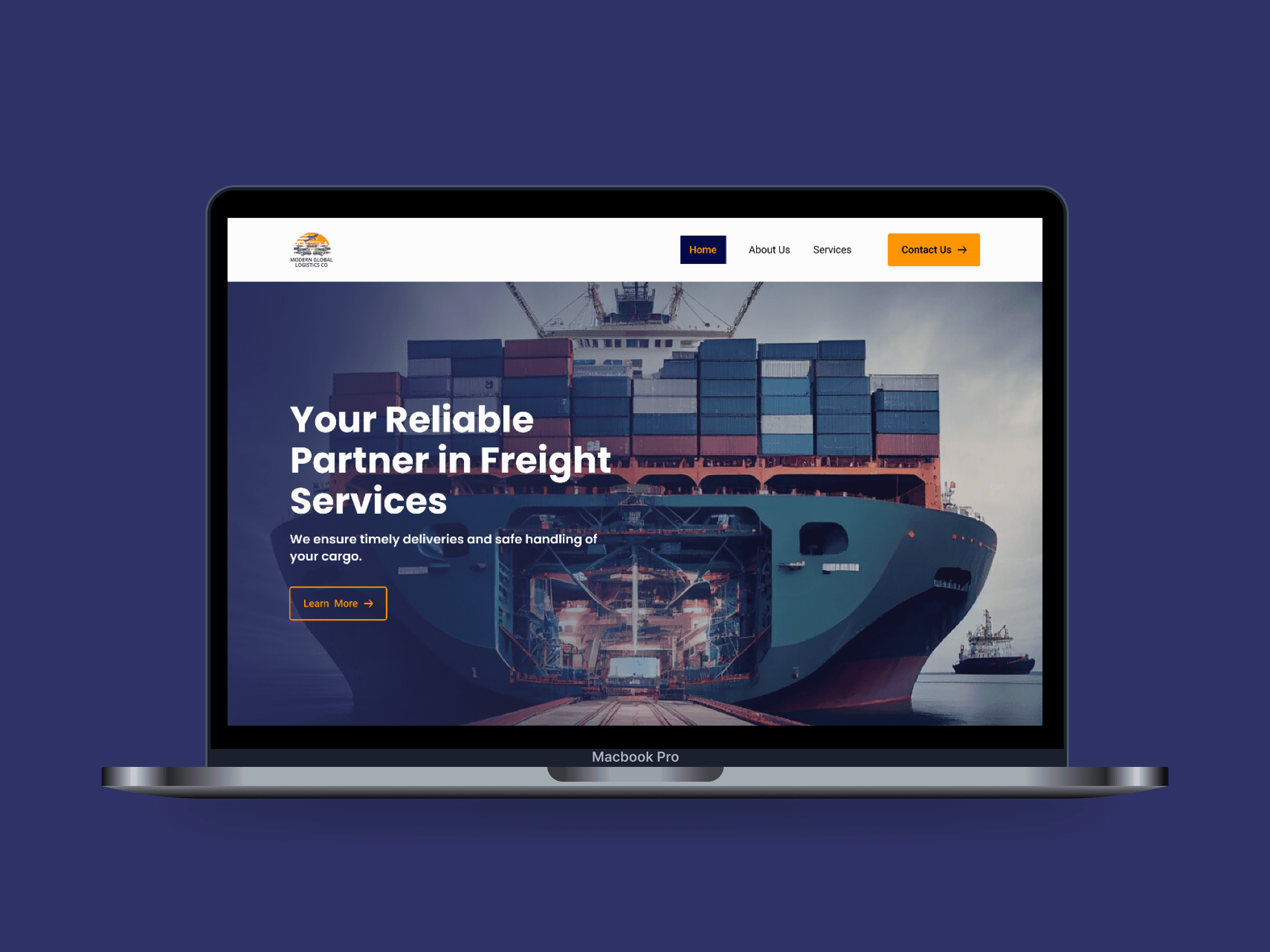
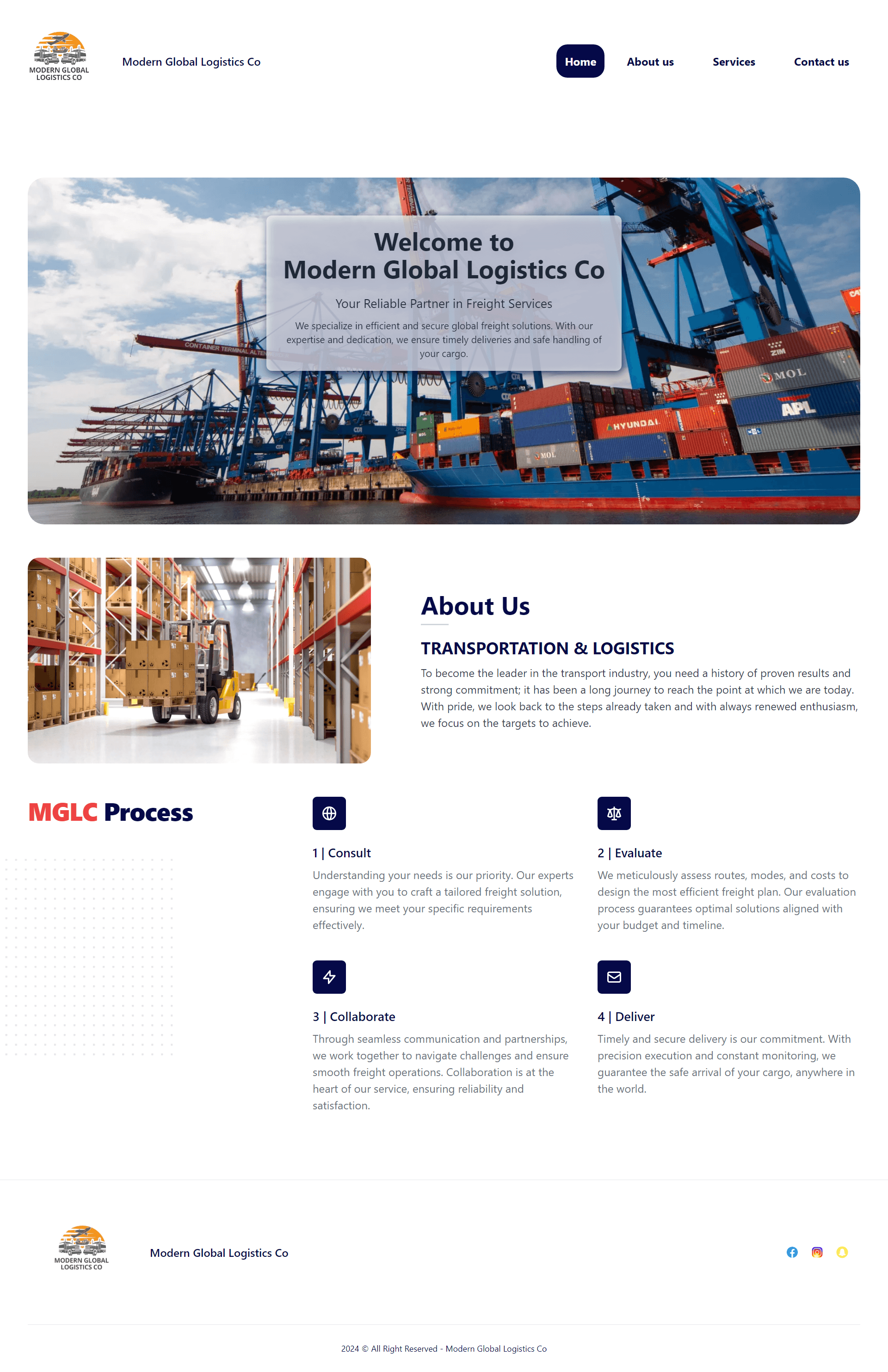
Fresh and enhanced website design with a better user experience increases user’s stay by keeping them engaged.
My Role
Product Designer
Timeline
Insights
Excessive text with no visual hierarchy
1
Excessive text causes cognitive load and increases the bounce rate.
2
3
No social proof or testimonials to earn users trust.


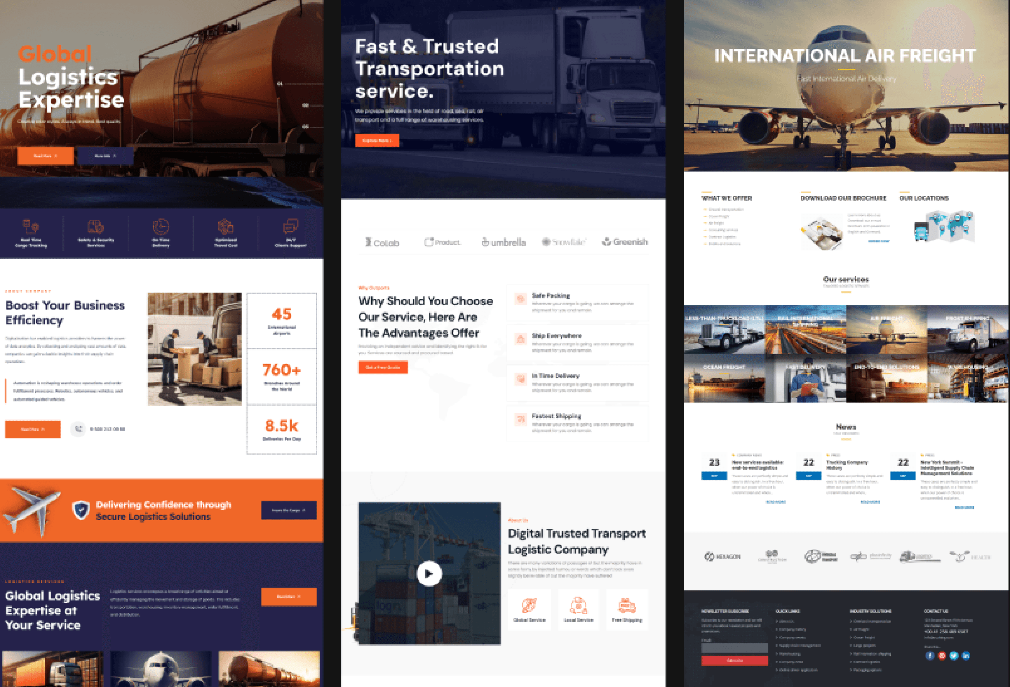
Competitive Analysis
Identified content & design patterns
I conducted a competitive analysis of 5-6 logistics websites to understand visitor experiences and recognize effective content and design patterns. This informed my hypotheses on key elements to include on the website and how to display them effectively.
Hypothesis
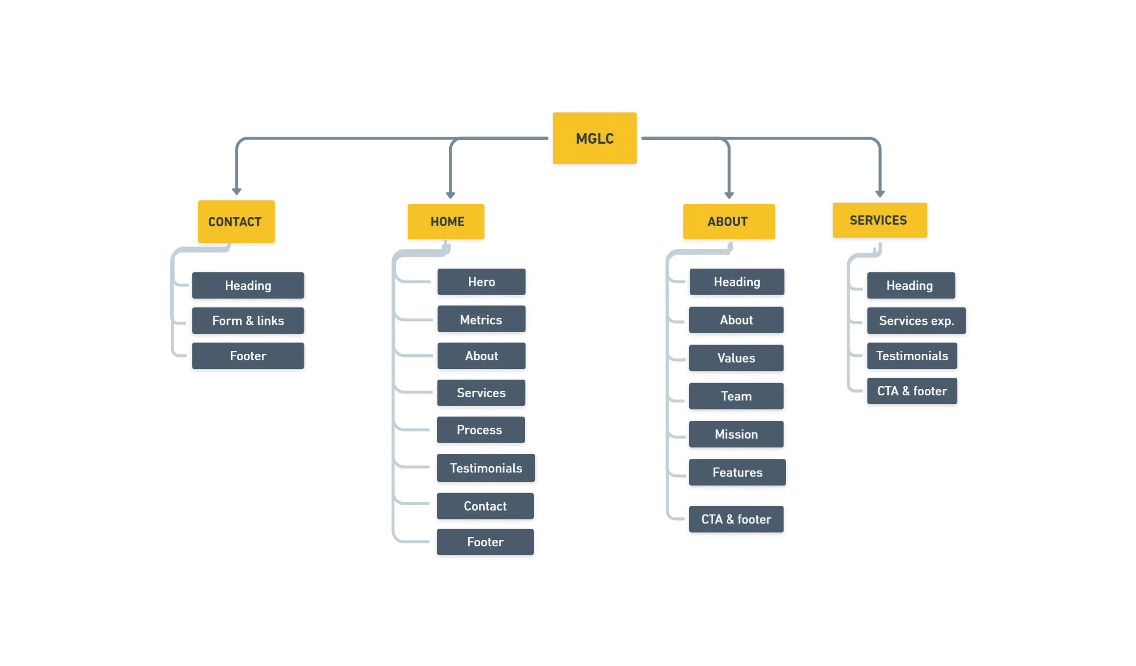
Sitemap
Organizing & structuring the pages
Created a sitemap to define the hierarchy of pages and ensure intuitive navigation, making it easier for users to find information quickly and efficiently.
Style Guide
Reflecting brand's identity & values
Created a style guide for maintaining a cohesive visual identity. It provided detailed specifications for design elements, ensuring uniformity across the website and strengthening brand recognition.
Typography
Mglc is a logistics website.
Mglc is a logistics website.
Mglc is a logistics website.
Mglc is a logistics website.
Mglc is a logistics website.
Color Pallete
#FF9500
#050948
#FCFCFC
#737373
#01020E
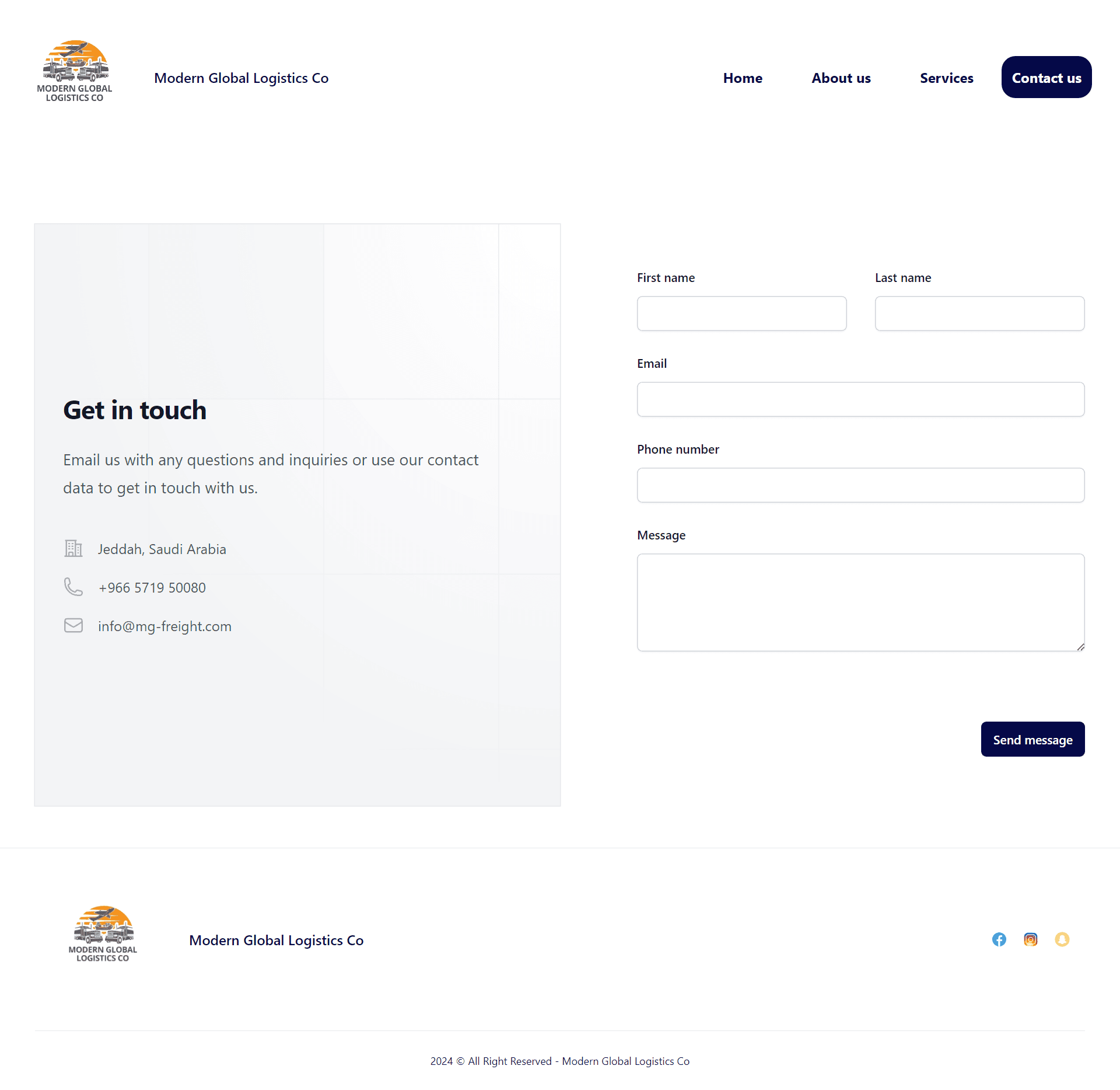
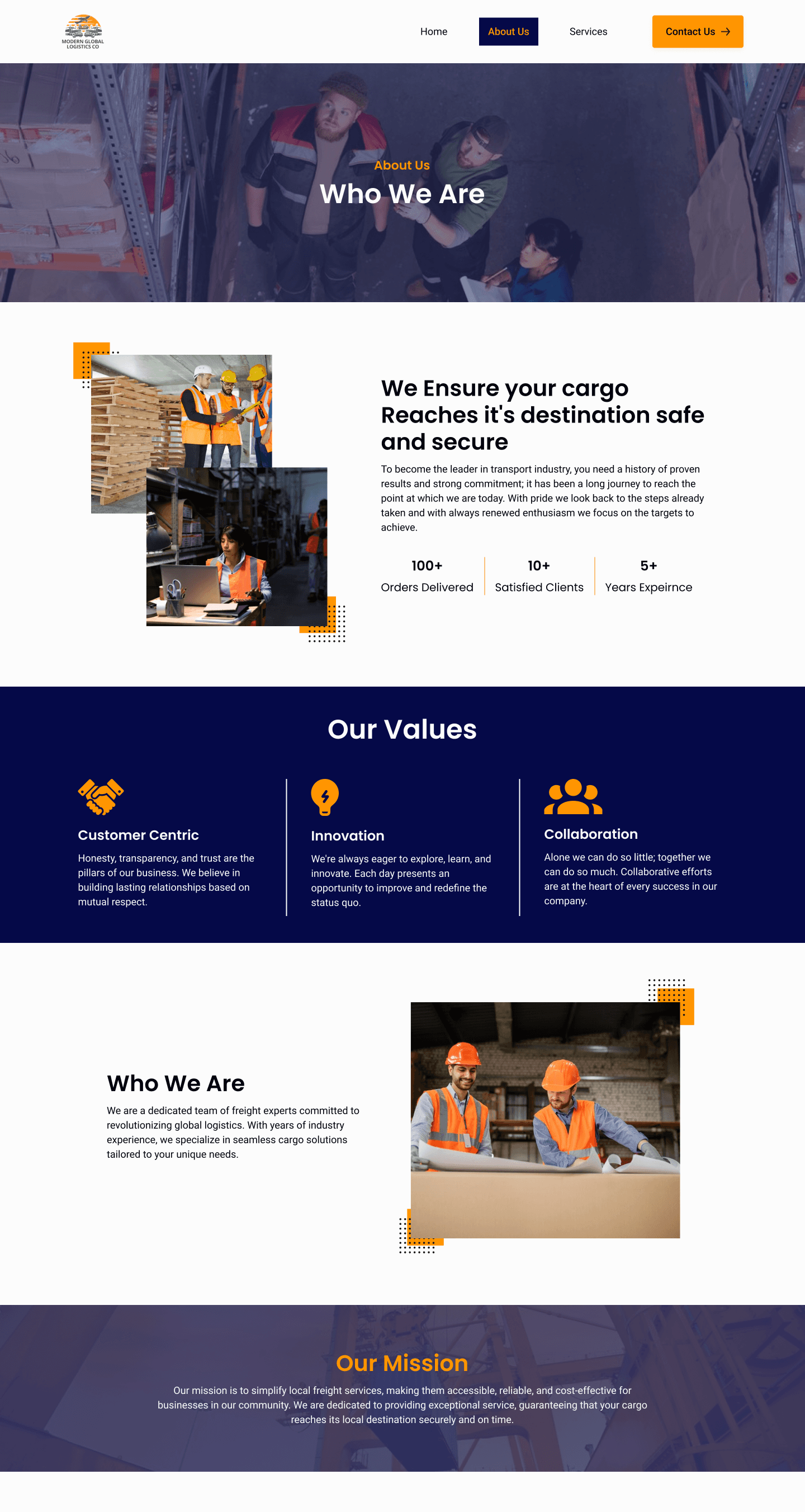
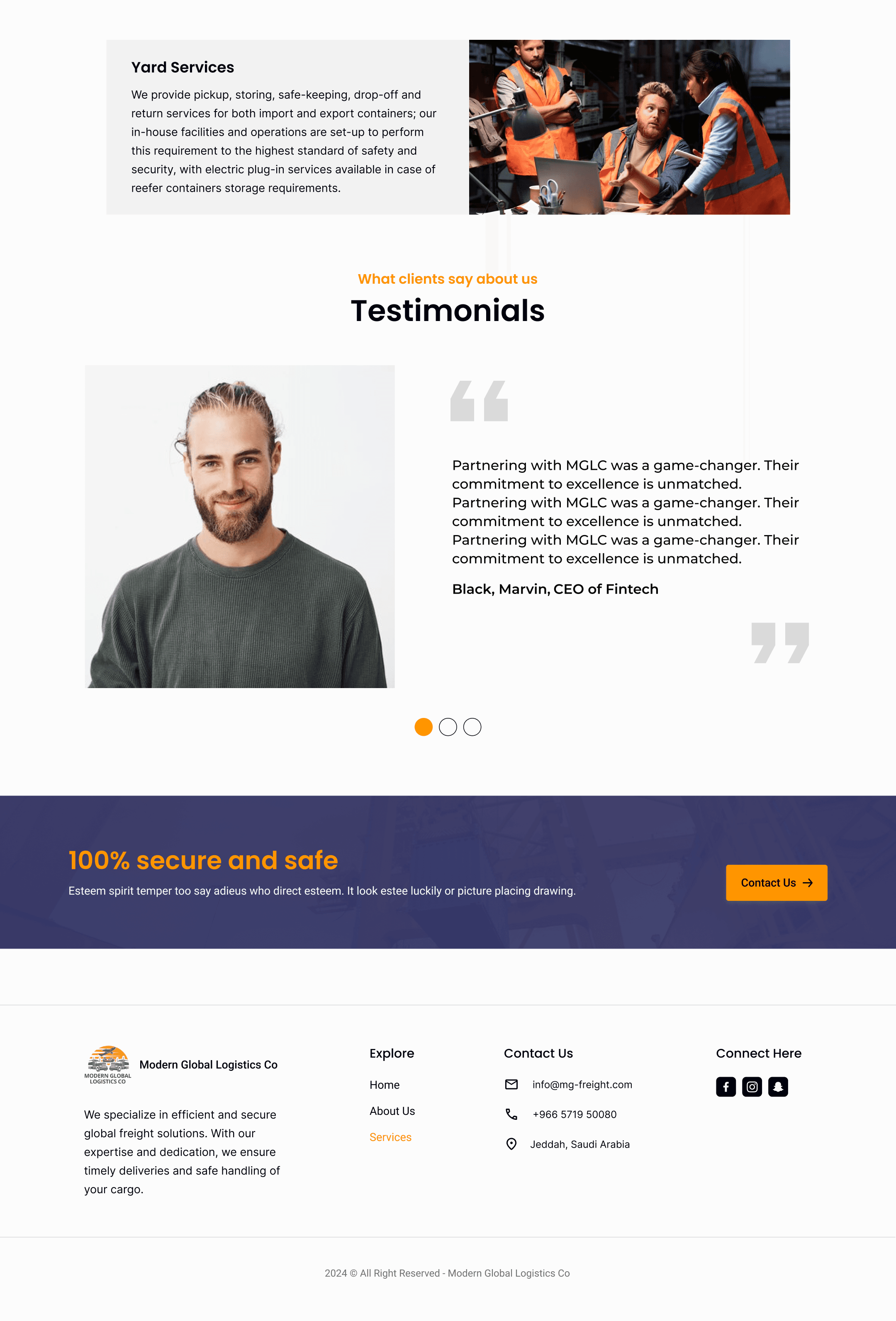
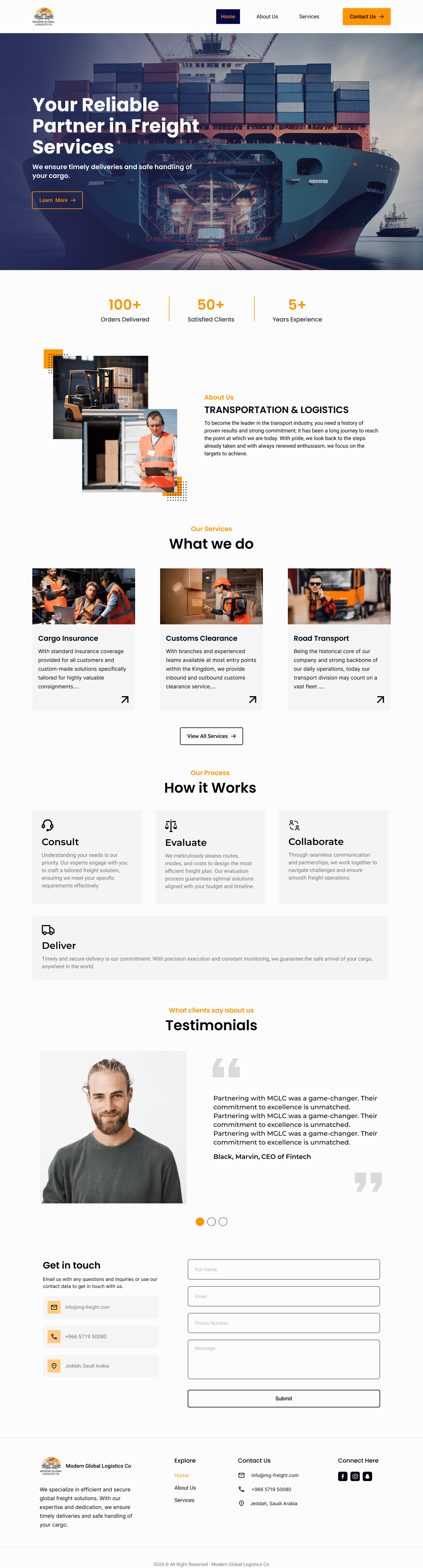
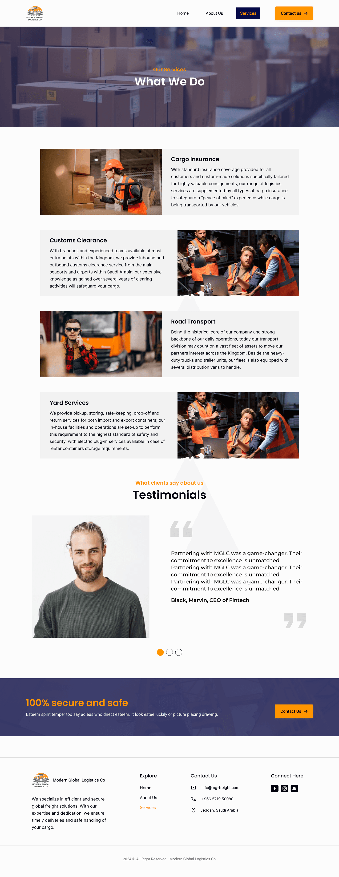
Website Design
Redesigning the interface with a better UX


Prototyping
Numbers game
Showing the number of projects being done successfully helps users or customers decide quickly to take the next step.
Learnings
Working on this project helps me understand how things work in the cargo industry. Also, I share the importance of seamless designs for business growth.
Get the job done
It's not mandatory to follow each process to get the desired outcome. That's why I skipped the wireframing due to a tight deadline.