
Overview
CDP websites consistently fail the same way, technical jargon aimed at engineers, weak product visualizations, and generic SaaS messaging that says nothing to the marketers who hold the budget and sign the contracts.
A modern marketing website that communicates a complex platform clearly, builds trust quickly, creates multiple conversion opportunities, and positions Ontarget as the go-to real-time CDP for personalized advertising.
Deliverables
Framer website design
Product MVP concept
Design System/UI kit
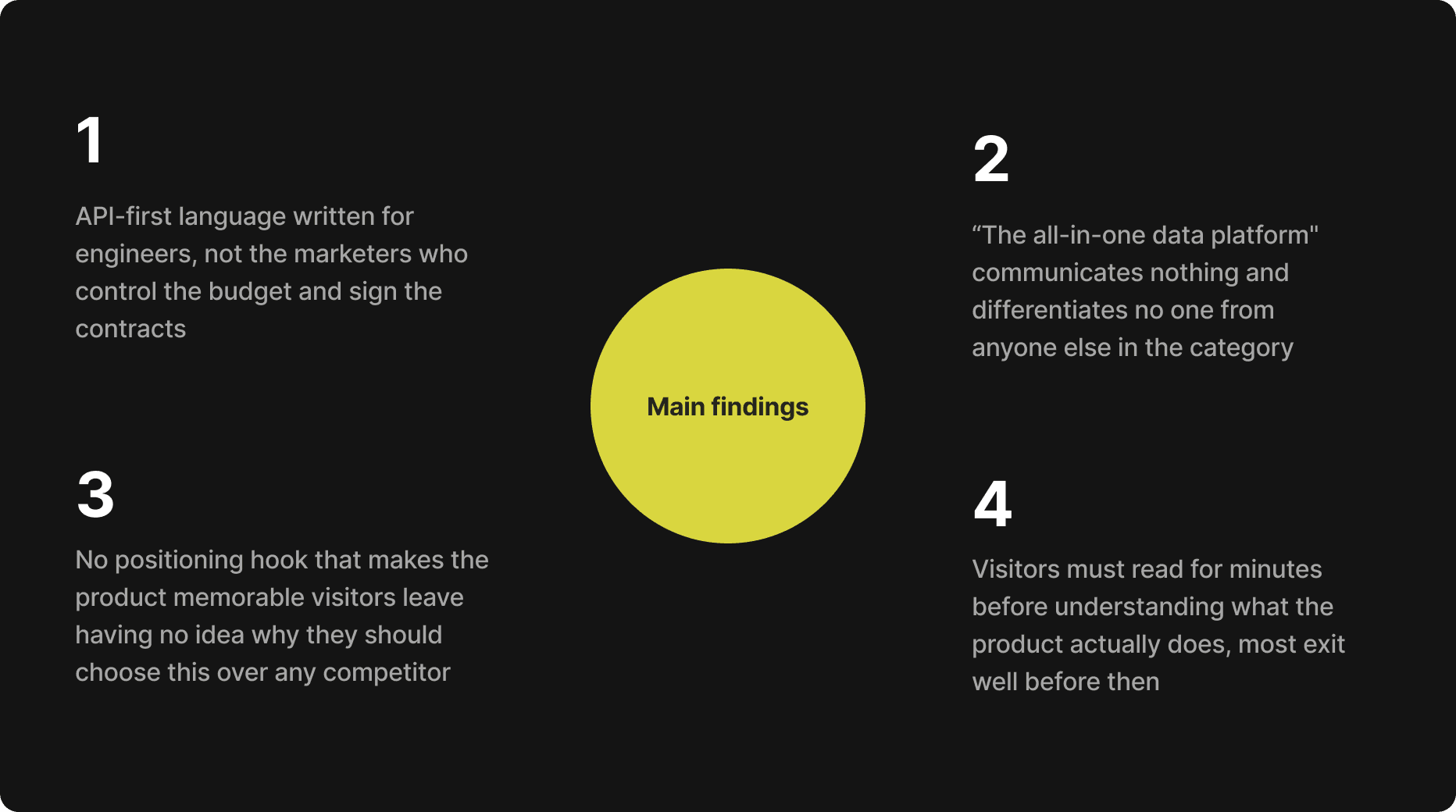
Insights
Difficult to find value & build trust
Before any wireframe was drawn, I audited the CDP category to understand how the market communicates and where it consistently fails. The patterns across top competitors were strikingly similar, and the gaps were just as consistent.
Competitive Analysis
Identified content & design patterns
I analyzed 3–4 top-tier CDP and related SaaS websites, Segment, mParticle, Tealium, and Insider, to understand what type of experience visitors encounter when they land. The goal was not to copy patterns but to identify gaps: where competitors consistently underserved their audience, and what Target could do differently.

Ideation Phase
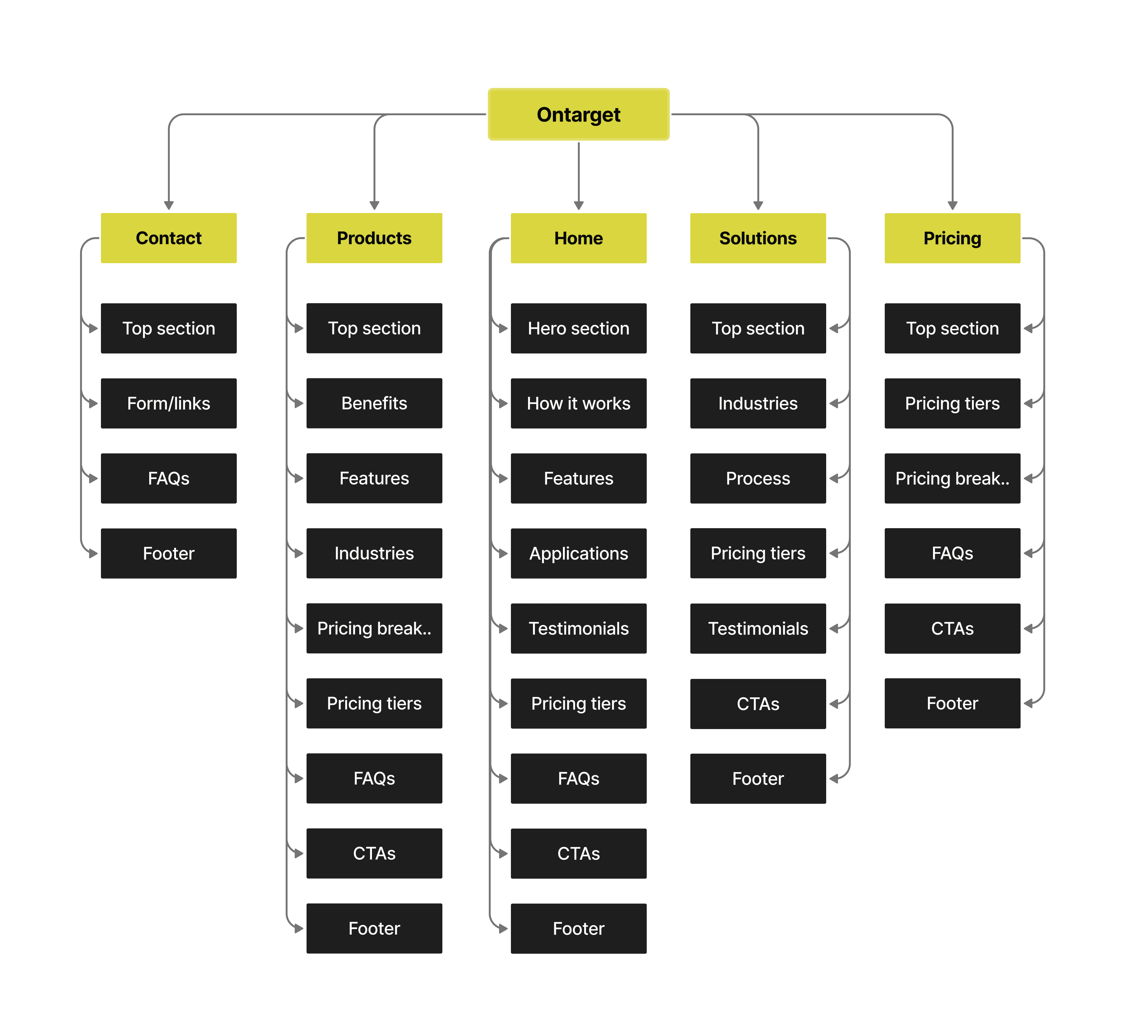
Information Architecture & Sitemap
Organizing & structuring the pages
Before touching a single visual, I built a sitemap to define the full page hierarchy and ensure intuitive navigation across all user entry points. The sitemap served as a blueprint for organizing content and guaranteeing that every page had a clear role in the overall conversion architecture, and that no visitor could get lost.
Style Guide
Reflecting brand's identity & values
A comprehensive style guide was developed to standardize all visual elements across the site. This ensured a unified look and feel, reinforced brand identity consistently across all pages, and made the Framer build phase significantly faster.

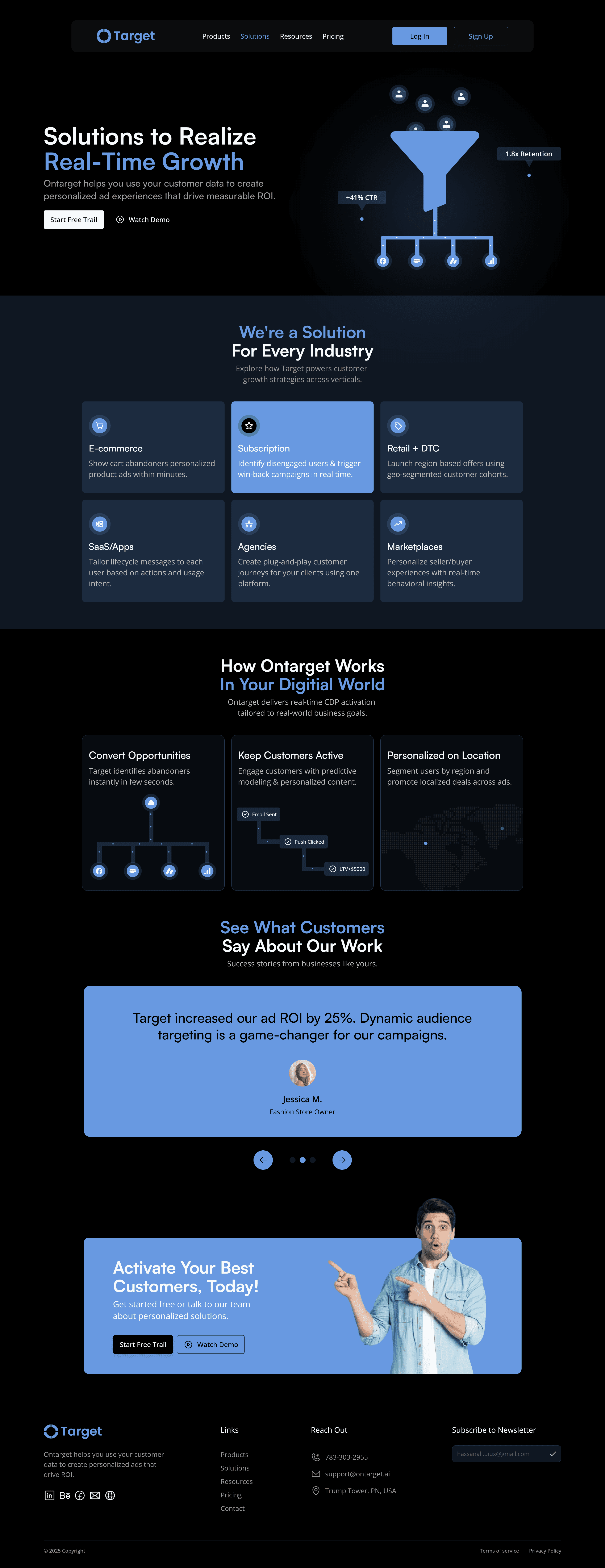
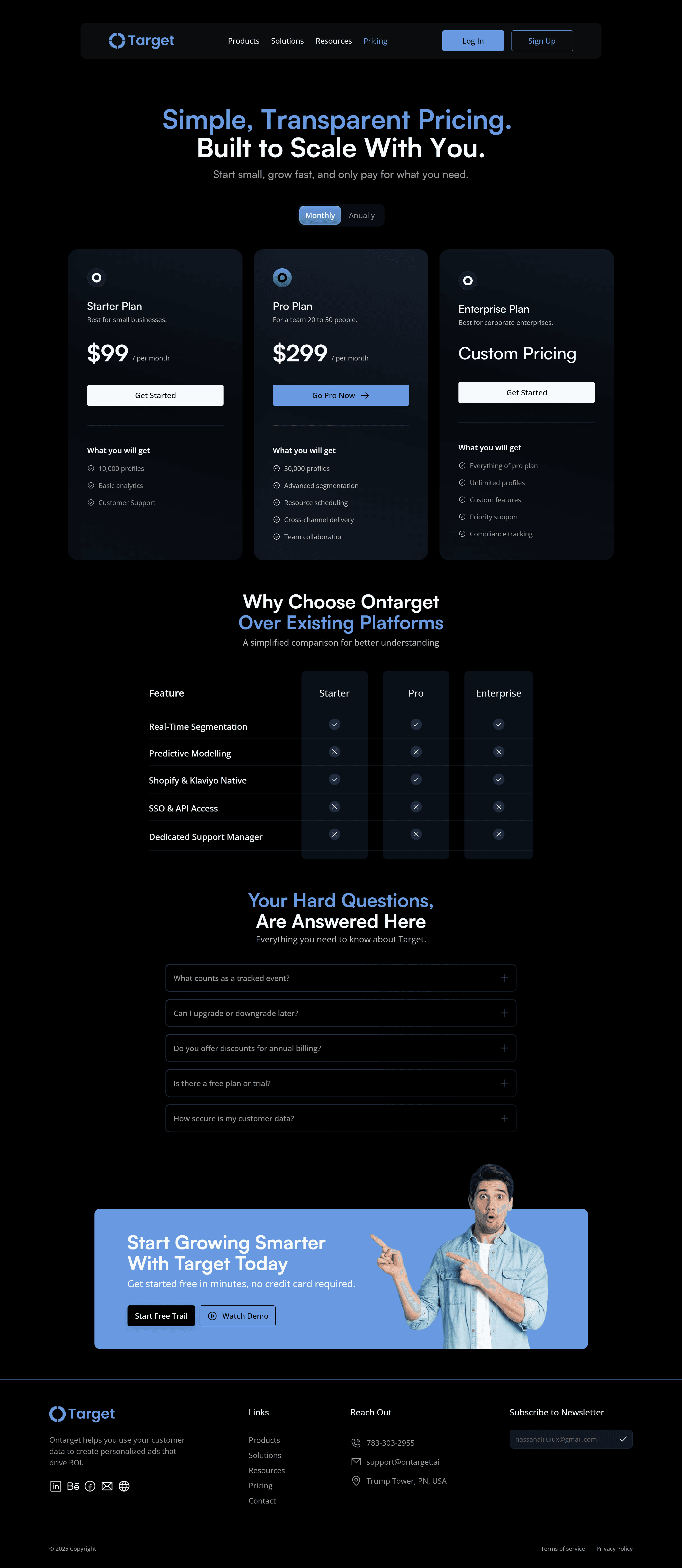
Website Design
Crafting the interface based on insights
With the research, hypothesis, and structure in place, every page was designed with a single primary conversion action and a consistent component language across all breakpoints


Prototyping
Audience clarity changes every decision
Identifying that the real buyer is a marketer, not an engineer, shaped every headline, CTA label, and section order. Designing for the right person from the start saved rounds of revision later.
Research reveals gaps, not just patterns
Competitive analysis taught me more from what competitors were missing than what they were doing well. Positioning privacy-first as a product benefit came directly from noticing every competitor buried it in a footer policy page.
End-to-end ownership sharpens decisions
Designing a site I also built in Framer changed how I designed. I thought about animation while composing layouts, and component reuse while building grids. The translation loss of a designer-developer handoff disappears entirely.


